Art Direction & Campaign Concept
A social-first cocktail campaign blending creative direction, vibrant visuals, and a drinks strategy that stayed true to the brand’s ethos.
Social-First Drinks Campaign
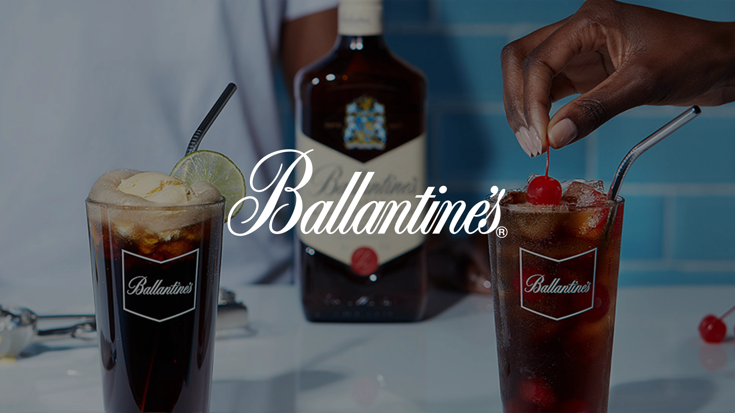
A visually playful campaign for Ballantine’s that turned whisky into a lifestyle experience, crafted to inspire, educate, and connect.
The Challenge
Deliver two distinct summer campaigns for Ballantine’s under their global platform, ‘No Wrong Way’, each with its own creative approach, but united by the goal of showcasing whisky’s versatility in fresh, culturally relevant ways.
With limited production budget, we needed to achieve high-volume, high-impact visual storytelling across formats, bringing bold flavour ideas and playful drinking rituals to life through smart, resourceful shoots.
The challenge was to make both campaigns feel premium, scroll-stopping, and globally adaptable, while staying grounded in the brand’s mission to show there’s no wrong way to enjoy whisky, just your way.
The Approach
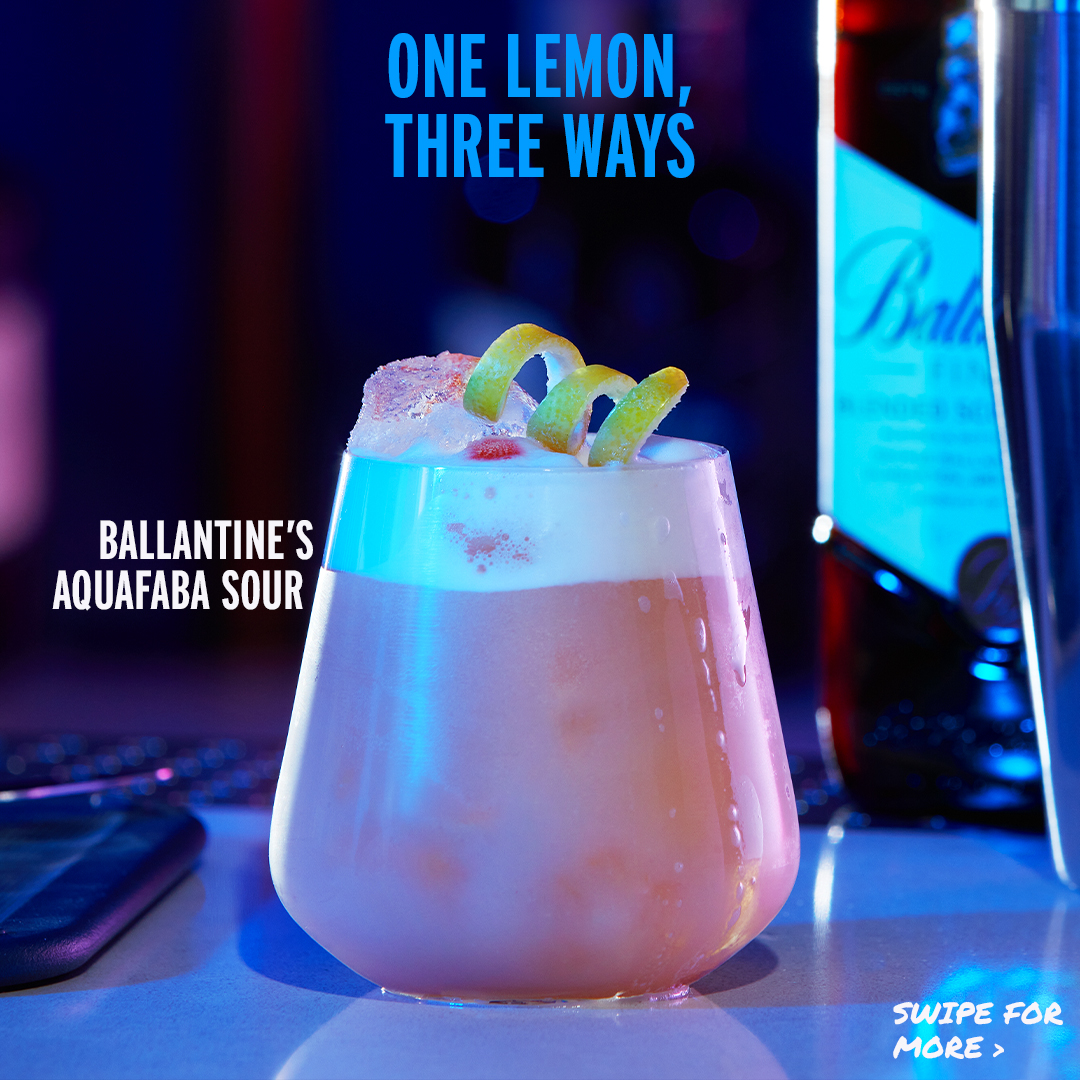
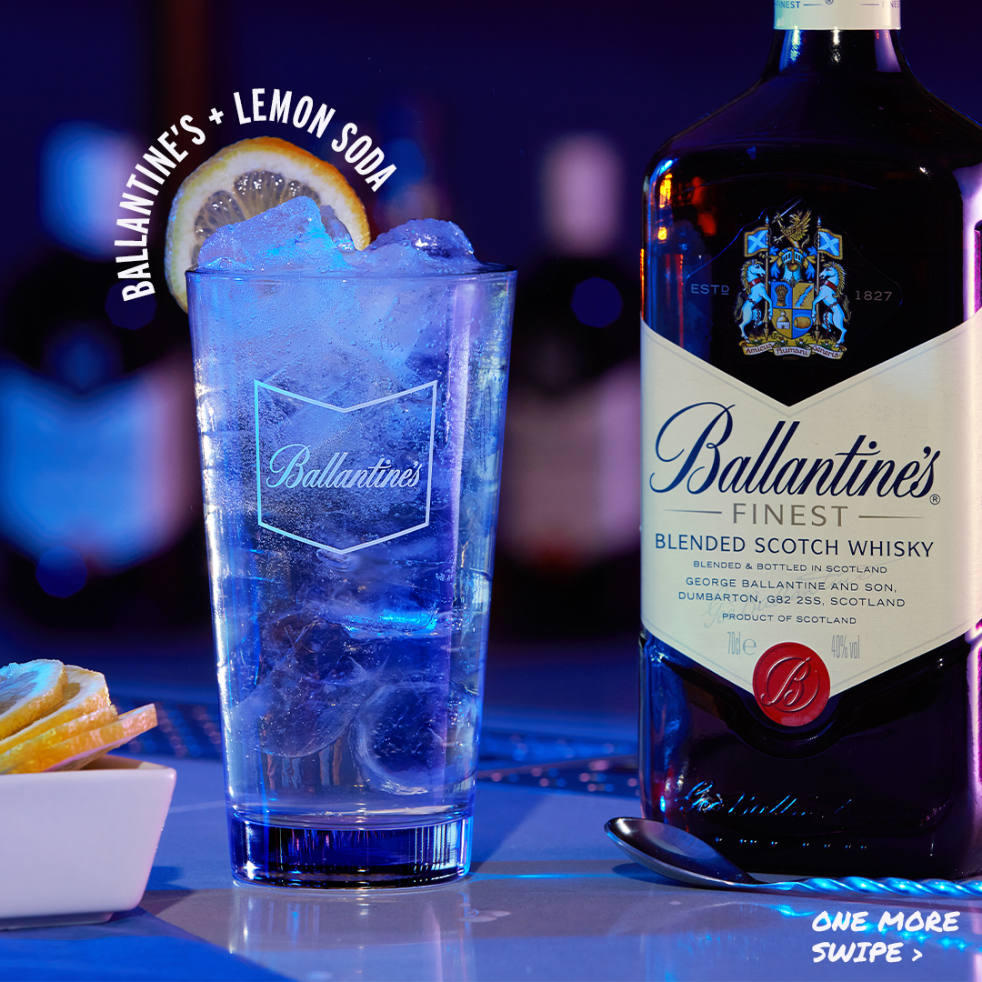
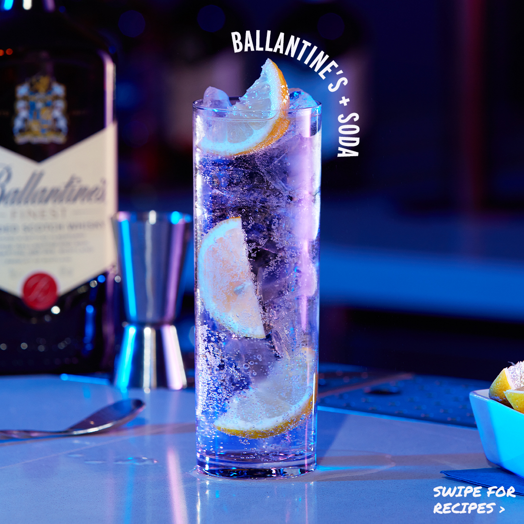
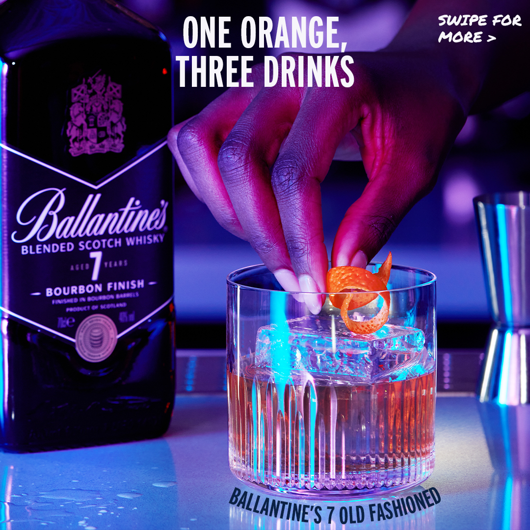
I developed two campaigns Ballantine’s 'Three Ways’ and ‘Summer Sipping’, both rooted in adaptability, built for modular storytelling, and designed to maximise visual output with minimal production spend.
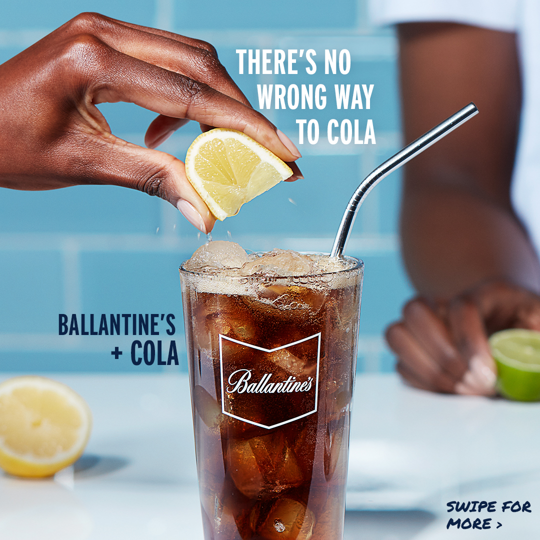
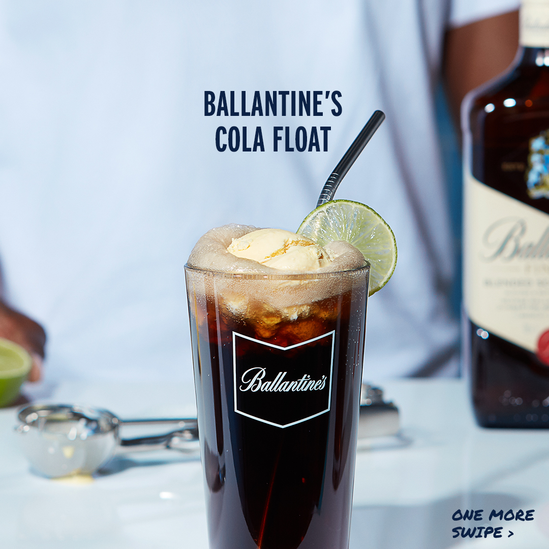
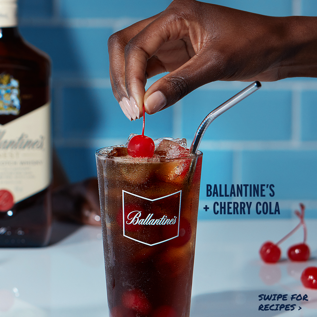
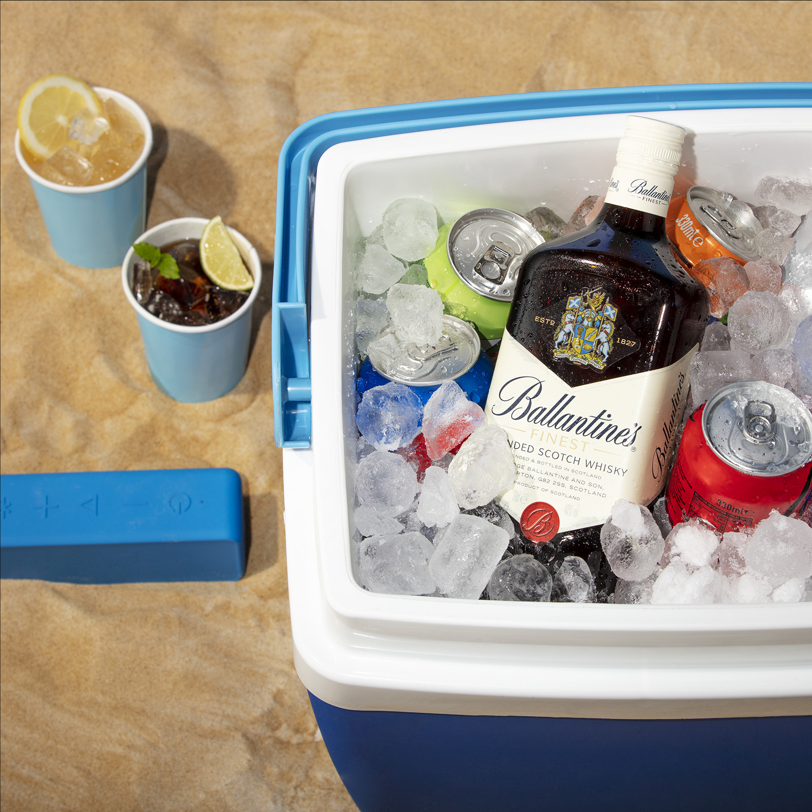
For Three Ways, the concept highlighted whisky’s versatility through one serve, three variations, like Ballantine’s & Cola with lemon, cherry cola, or as a float. The format was made for carousels, encouraging save-ability and international reuse. With just two shoot setups (day and night), I led the creative direction, lighting concepts, and art direction on set, working closely with the photographer (who built the kitchen environment), account lead, and client to ensure cohesion and quality. I sourced and styled all props, managed the shoot layout, and directed the visual narrative to stretch the output across multiple formats.
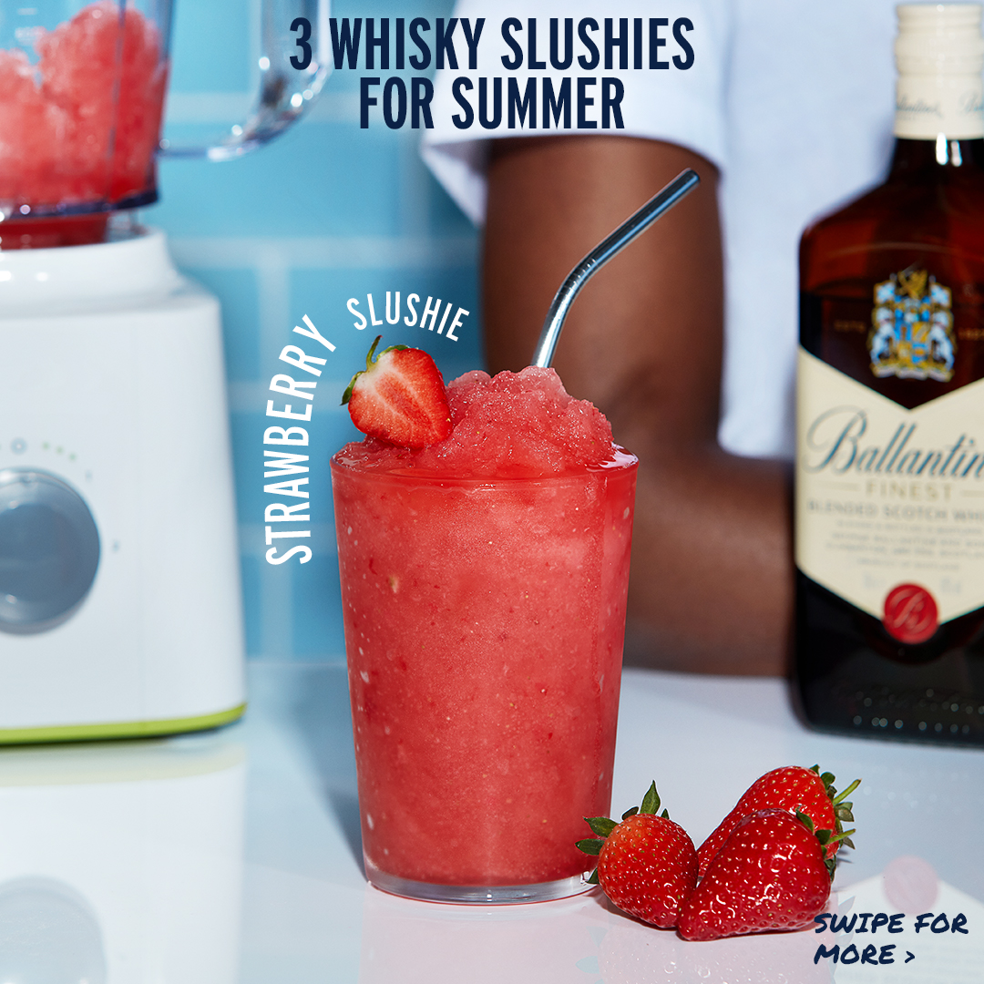
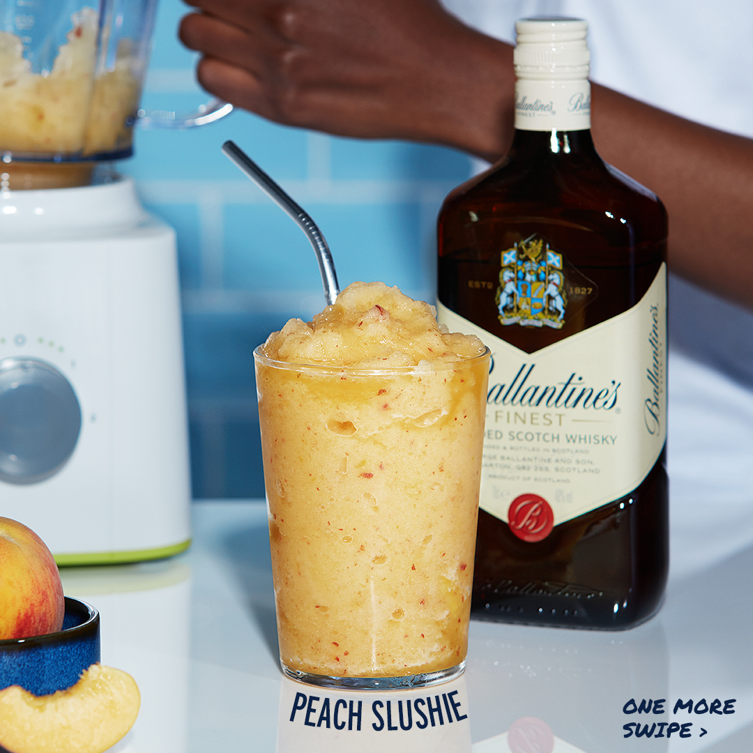
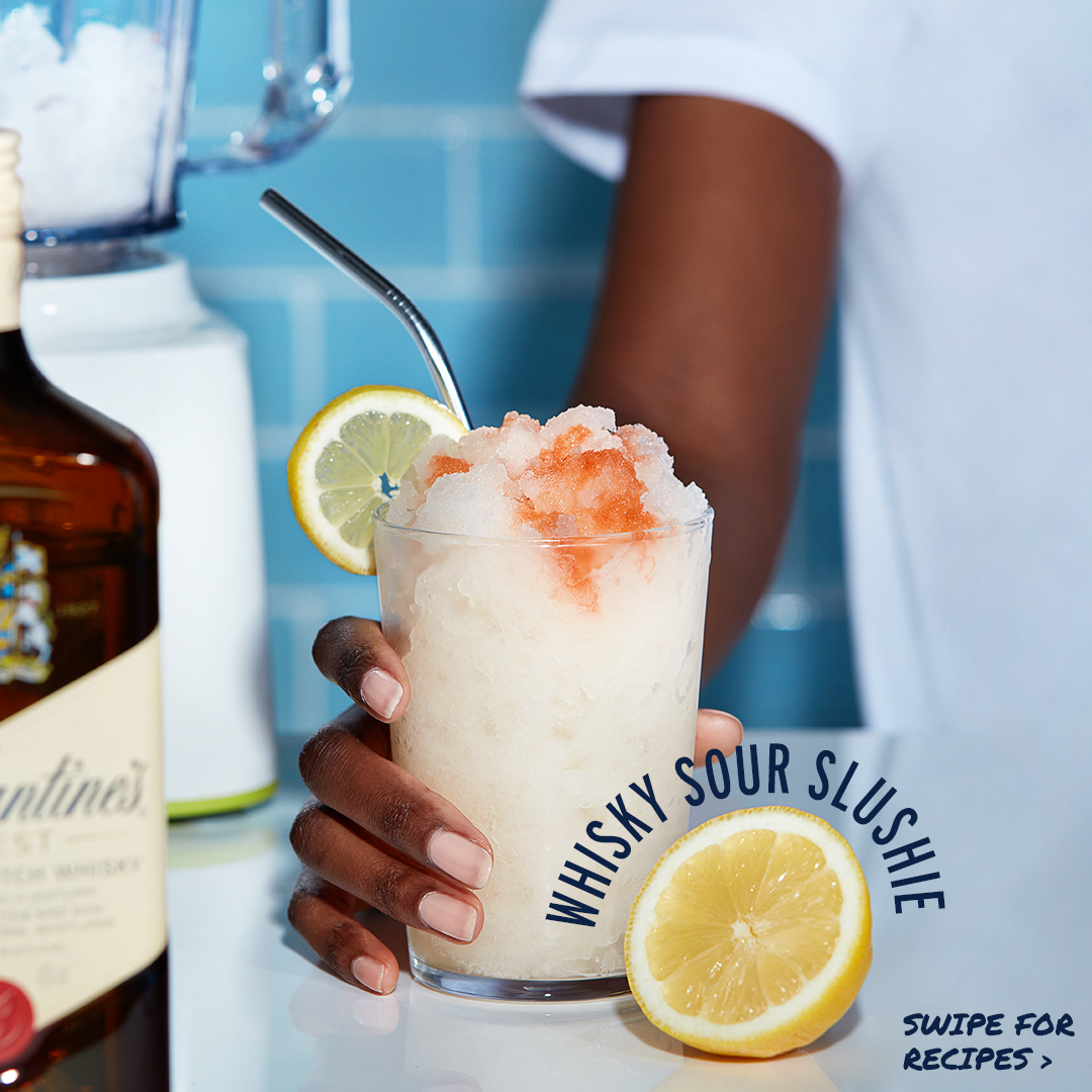
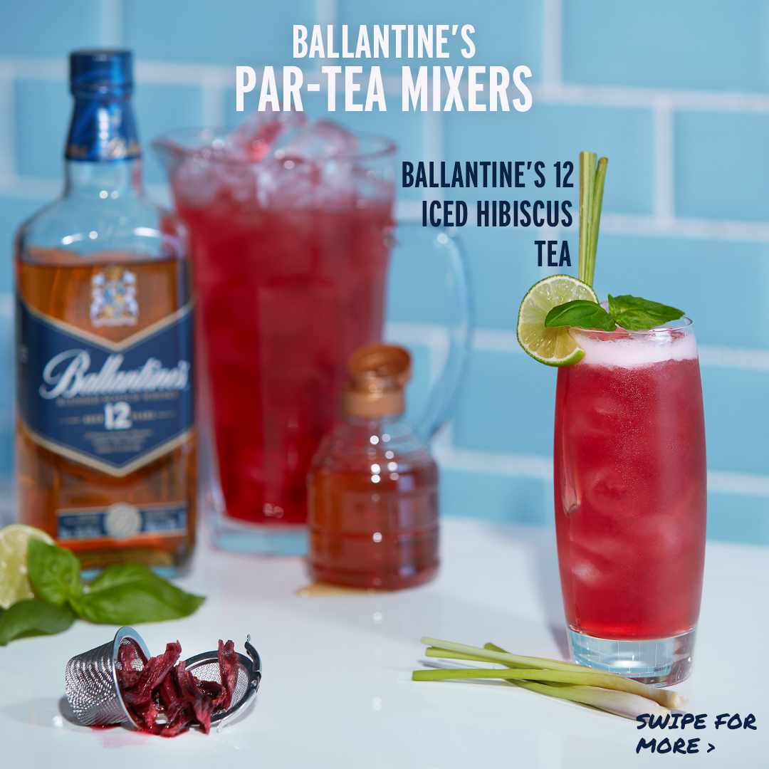
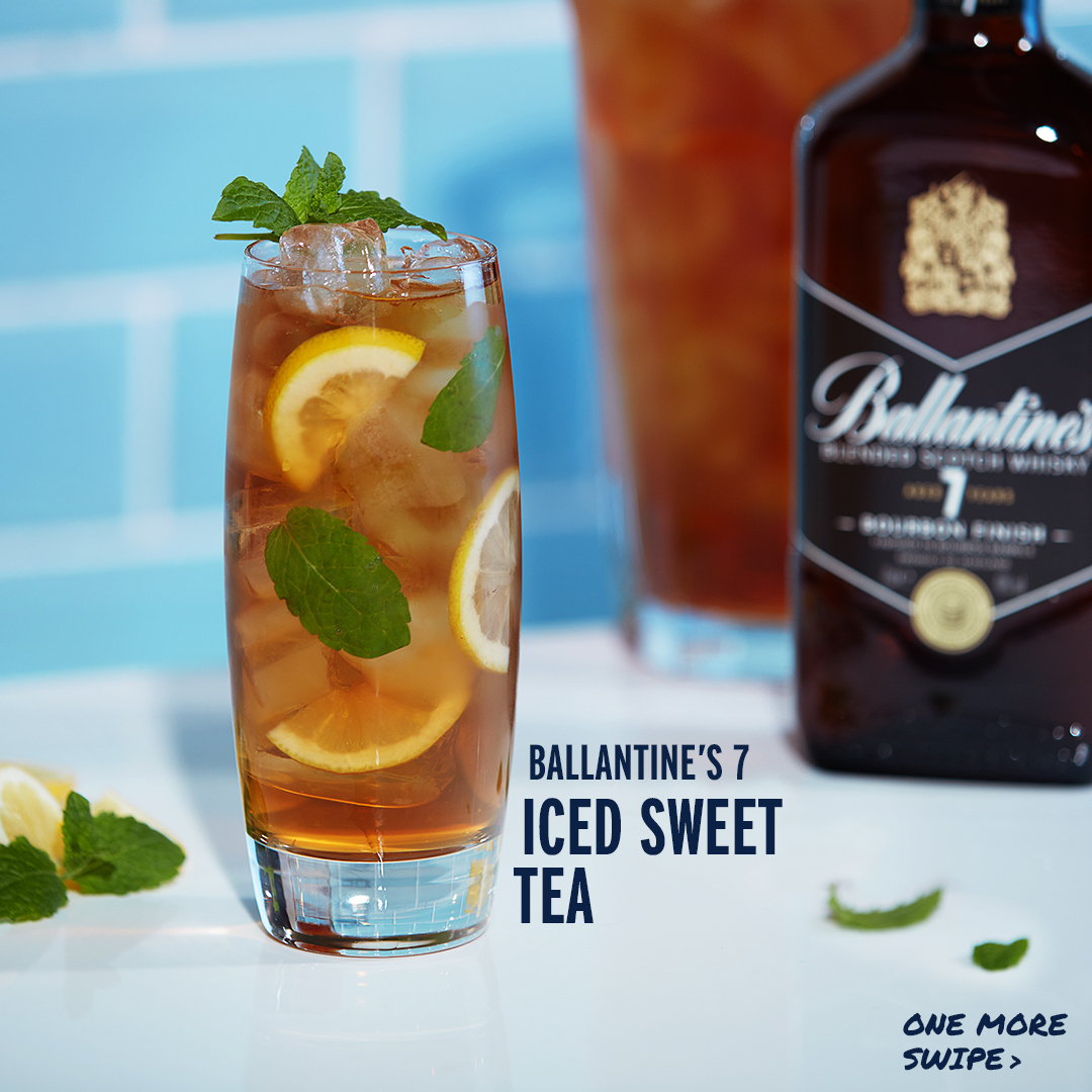
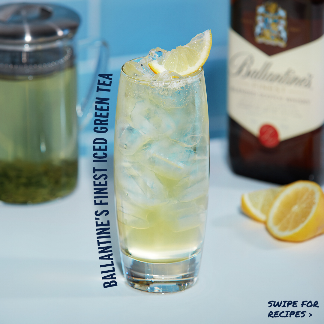
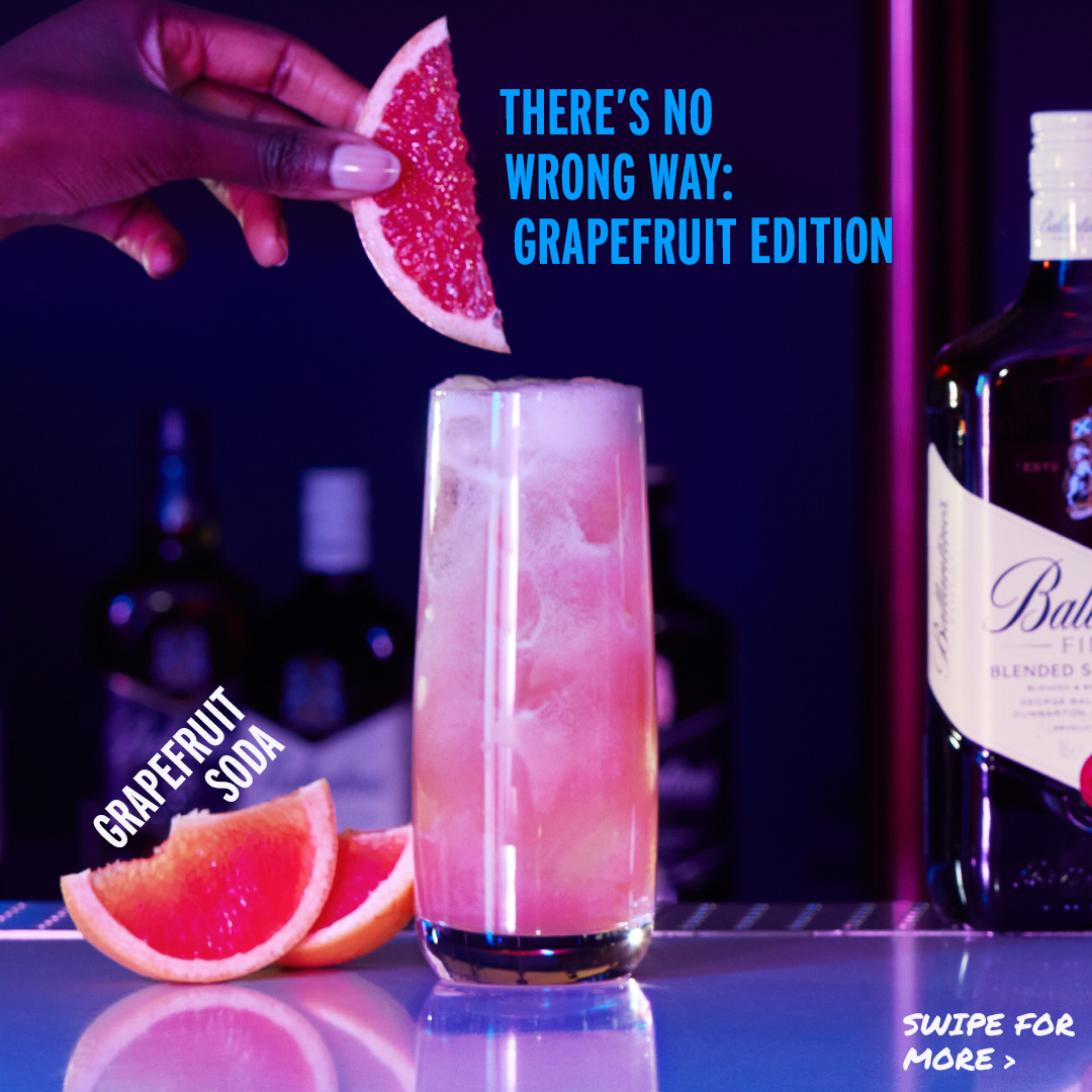
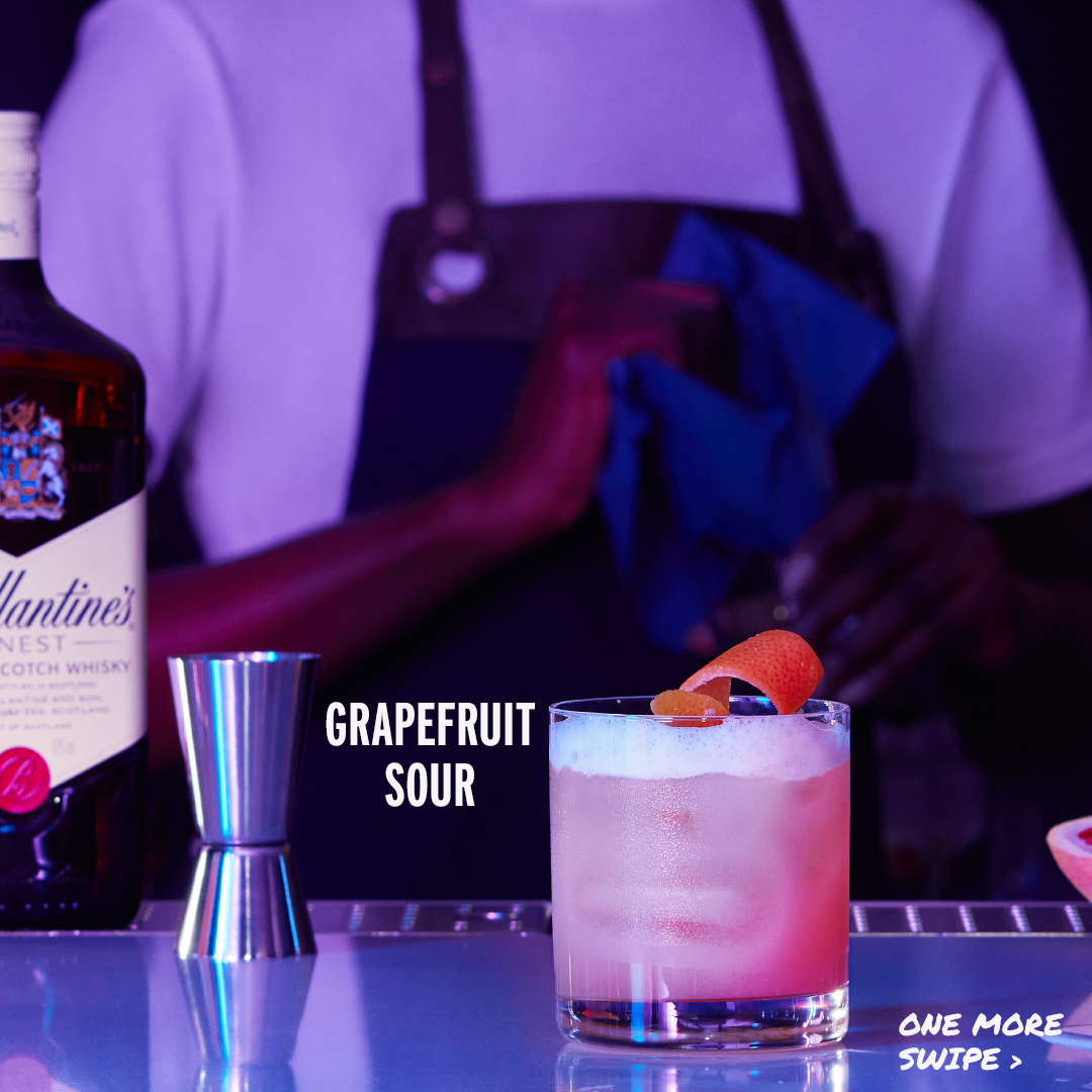
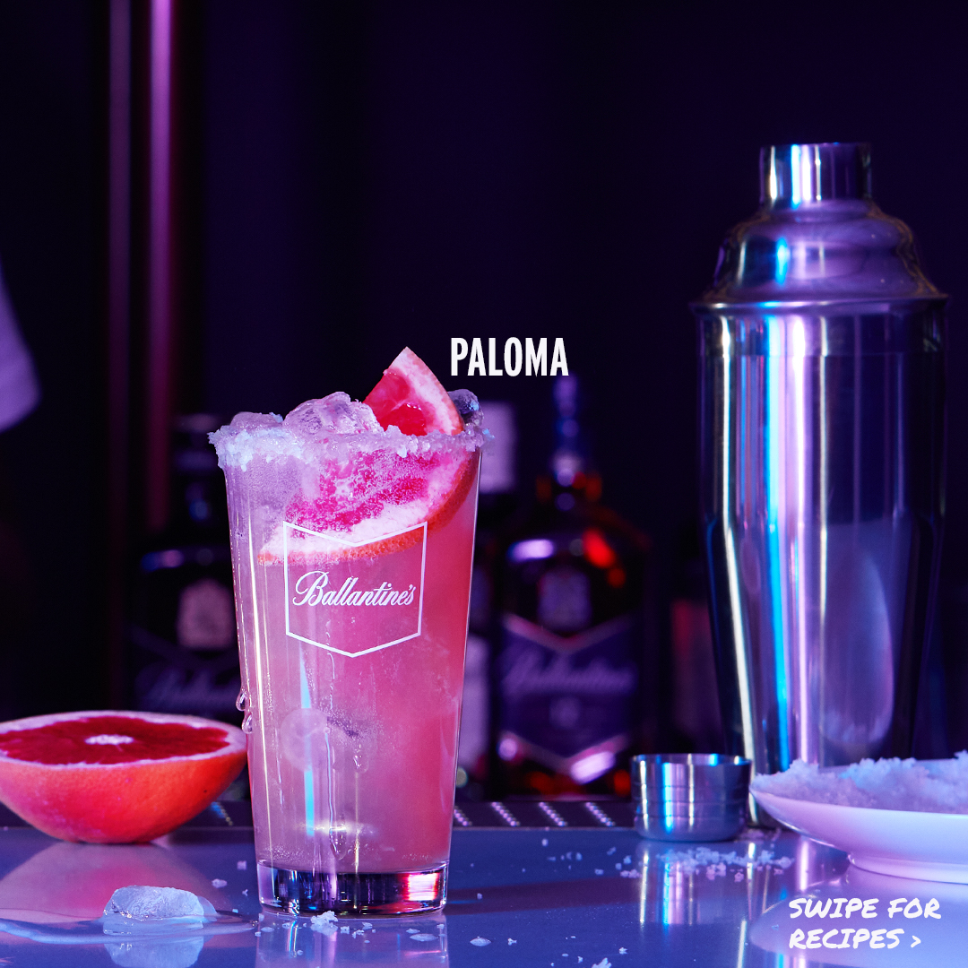
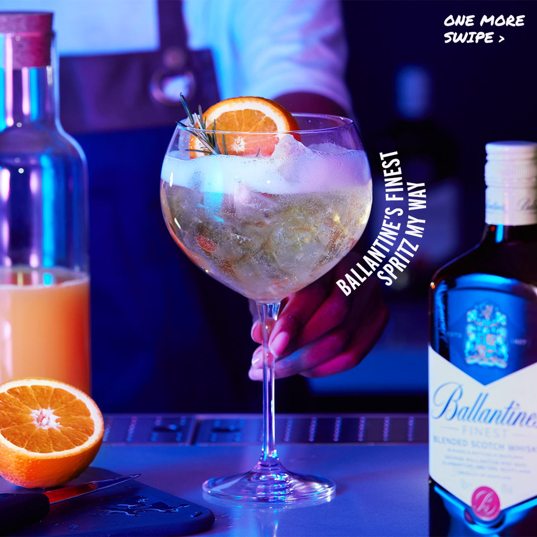
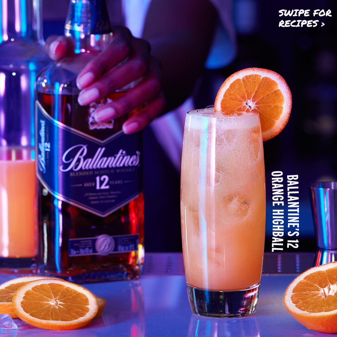
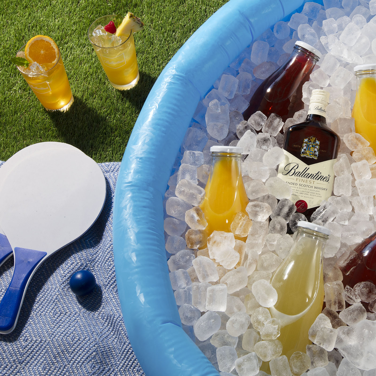
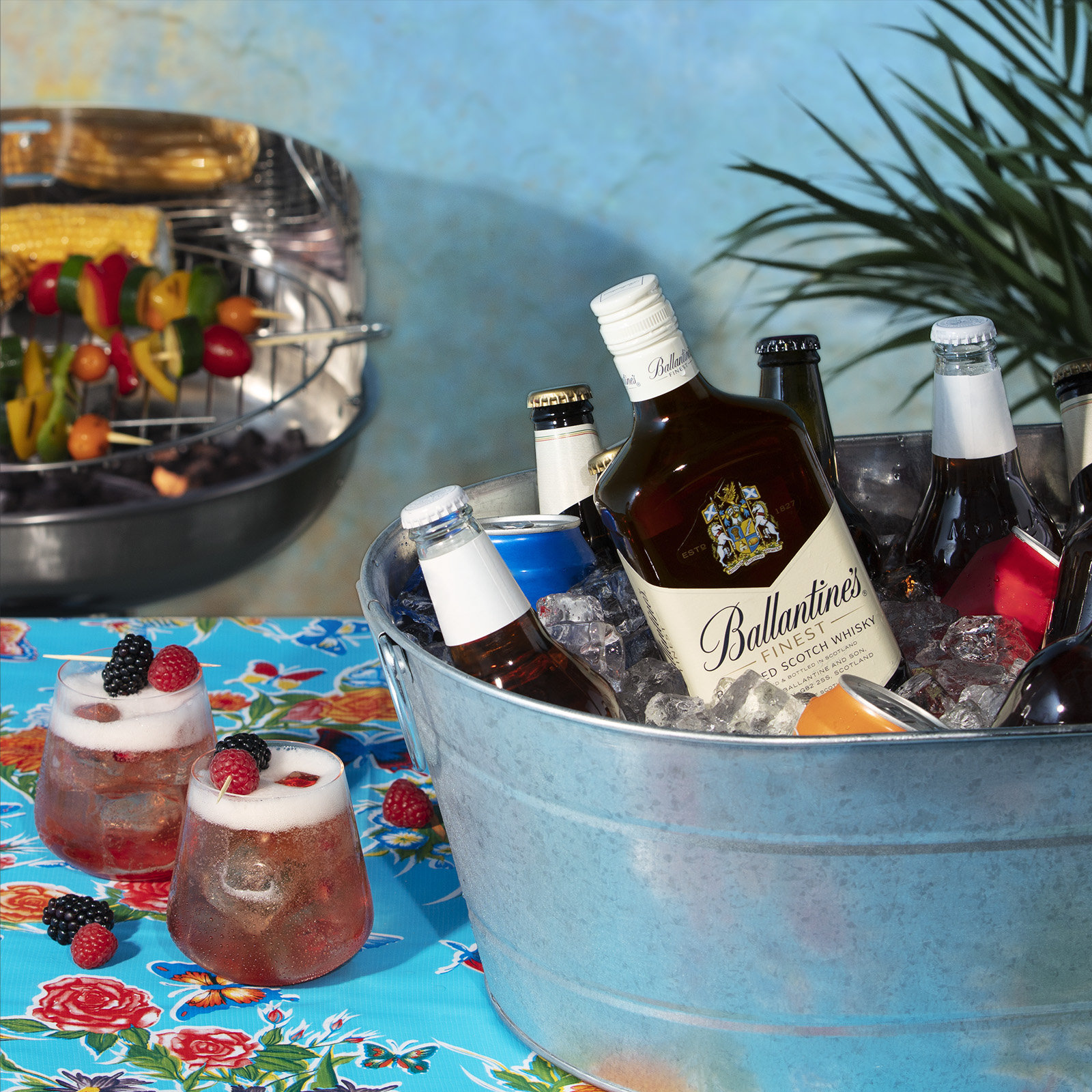
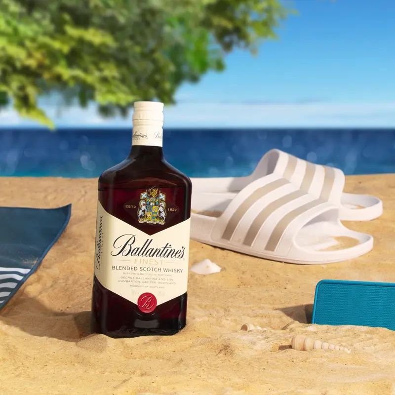
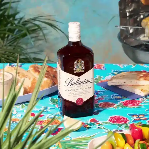
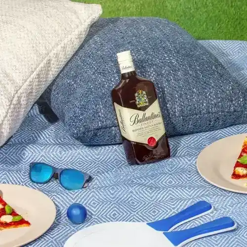
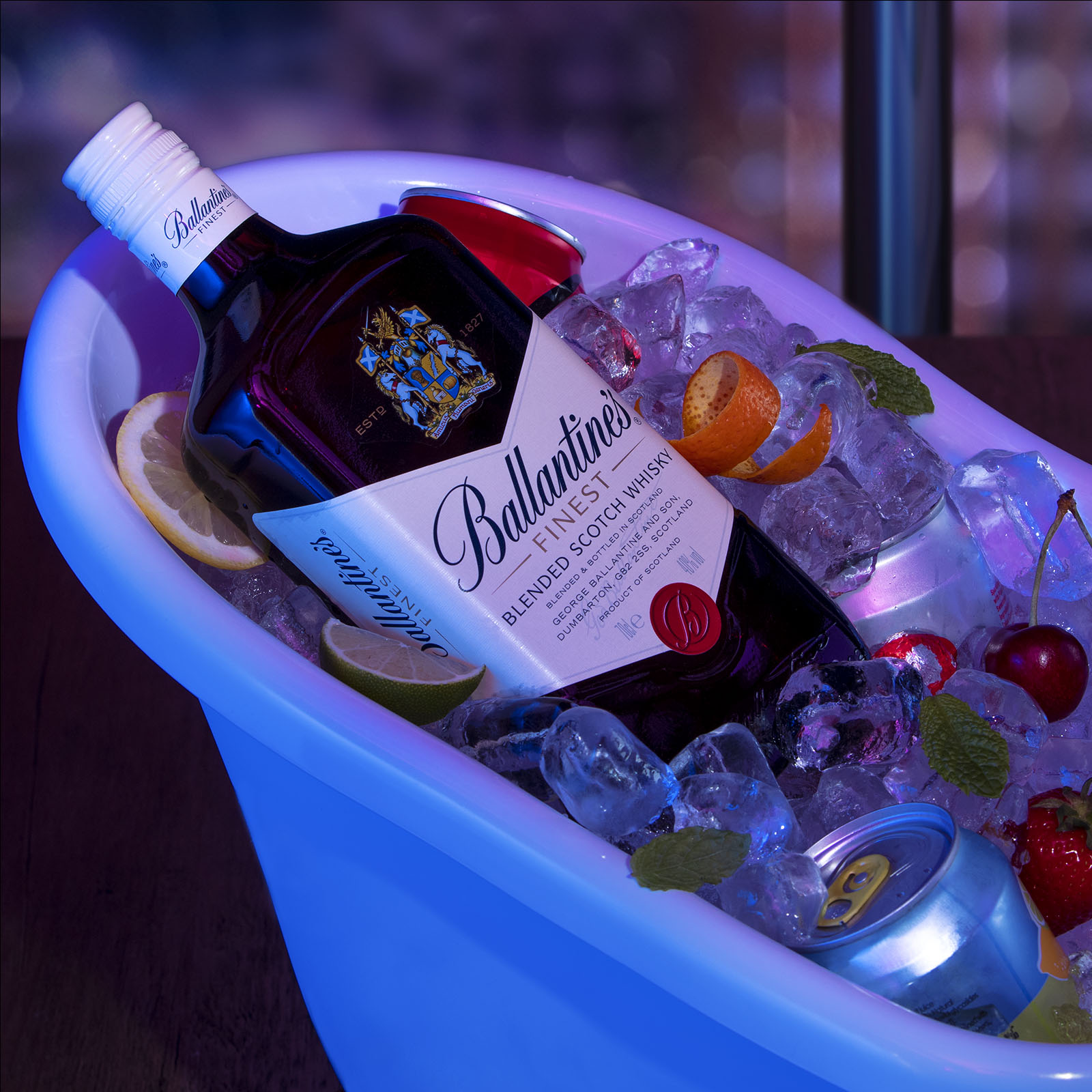
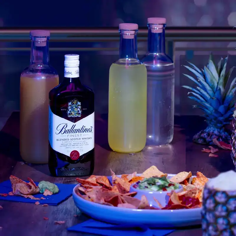
For Summer Sipping, I crafted two visual stories within a single production. One shoot focused on fruit-forward serves, using hollowed citrus and melons as drink vessels, offering bold, summer-ready inspiration. The second shoot introduced sculptural ice blocks to explore tone and flavour through different drink pairings. I led creative direction, storyboarding, and motion prep, separating layers for animation to evolve the visuals into playful, social-first assets. Every detail supported Ballantine’s ‘No Wrong Way’ message through creative, cost-conscious storytelling.
For Three Ways, the concept highlighted whisky’s versatility through one serve, three variations, like Ballantine’s & Cola with lemon, cherry cola, or as a float. The format was made for carousels, encouraging save-ability and international reuse. With just two shoot setups (day and night), I led the creative direction, lighting concepts, and art direction on set, working closely with the photographer (who built the kitchen environment), account lead, and client to ensure cohesion and quality. I sourced and styled all props, managed the shoot layout, and directed the visual narrative to stretch the output across multiple formats.
For Summer Sipping, I crafted two visual stories within a single production. One shoot focused on fruit-forward serves, using hollowed citrus and melons as drink vessels, offering bold, summer-ready inspiration. The second shoot introduced sculptural ice blocks to explore tone and flavour through different drink pairings. I led creative direction, storyboarding, and motion prep, separating layers for animation to evolve the visuals into playful, social-first assets. Every detail supported Ballantine’s ‘No Wrong Way’ message through creative, cost-conscious storytelling.
The Results
- Achieved 12.5% higher engagement than Ballantine’s average social content
- The concept was adopted across the global drinks strategy
- Helped reshape Ballantine’s social presence into one that felt modern, unpretentious, and culturally relevant
- Established a new creative blueprint for future campaigns for the lighting and styling to storytelling structure
Process
A breakdown of how we brought Ballantine’s ‘No Wrong Way’ message to life across two summer campaigns, combining big ideas, tight budgets, and adaptable visuals.
01
Concept & Ideation.
Each campaign began with a clear, strategic concept designed to reflect Ballantine’s ‘No Wrong Way’ ethos. I developed two creative platforms, one showcasing drink versatility through modular storytelling (Three Ways), and one focused on seasonally playful, fruit-forward serves and ambient setups (Summer Sipping). Both ideas were tailored to feel social-first, repeatable, and globally relevant, all while staying production-efficient.

02
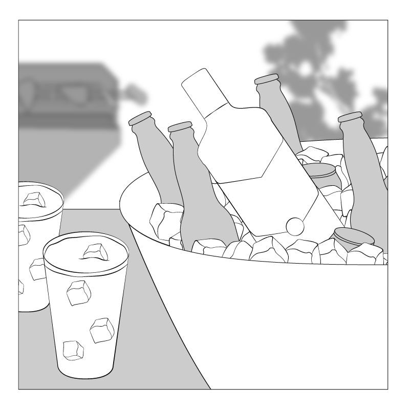
Scamping, Planning & Prop Sourcing.
Once the concepts were approved, I created visual scamps to guide the shoot direction and built out prop lists aligned to each scenario. From citrus fruits and coloured gels to ice moulds and glassware, every element was sourced with intention. I worked closely with the photographer to ensure the setups could deliver high-impact results within tight timelines and budget.
03
Creative Direction & Shoot Execution.
On set, I led art direction and visual continuity across scenes. I guided styling, composition, and content variation, ensuring each setup delivered multiple crops, formats, and storytelling layers. The shoot was split into structured day and night environments, each optimised for specific campaign moments while sharing a cohesive look and feel.
04
Post-Production & Animation Prep.
In post, I handled all retouching, including colour grading, cropping, and content formatting. For the Summer Sipping campaign, I prepared visuals for animation by working with layered assets, planned in pre-production to enable parallax and panning effects. These motion-ready visuals brought the campaign to life on social, adding movement, depth, and energy to an already vibrant creative story.
the visuals
From concept to content, here’s how it rolled out across carousels, motion, and reactive social formats.